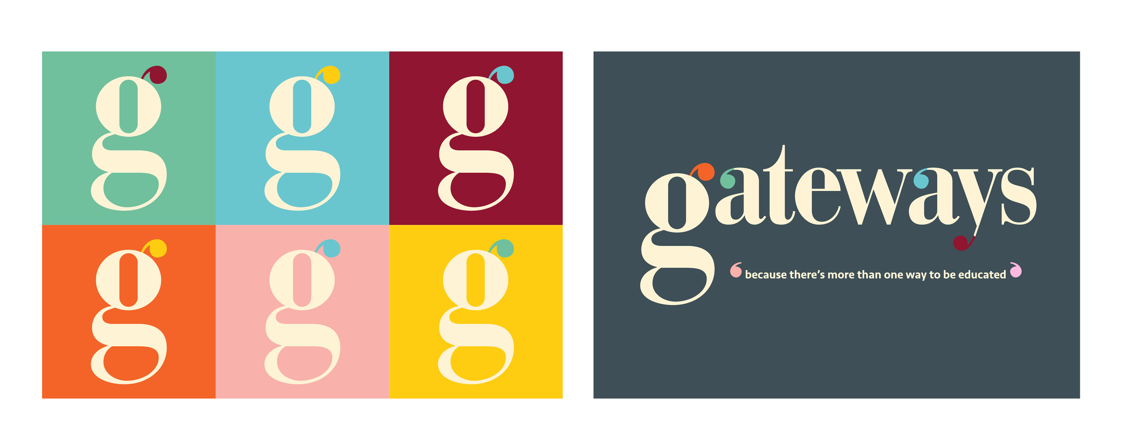
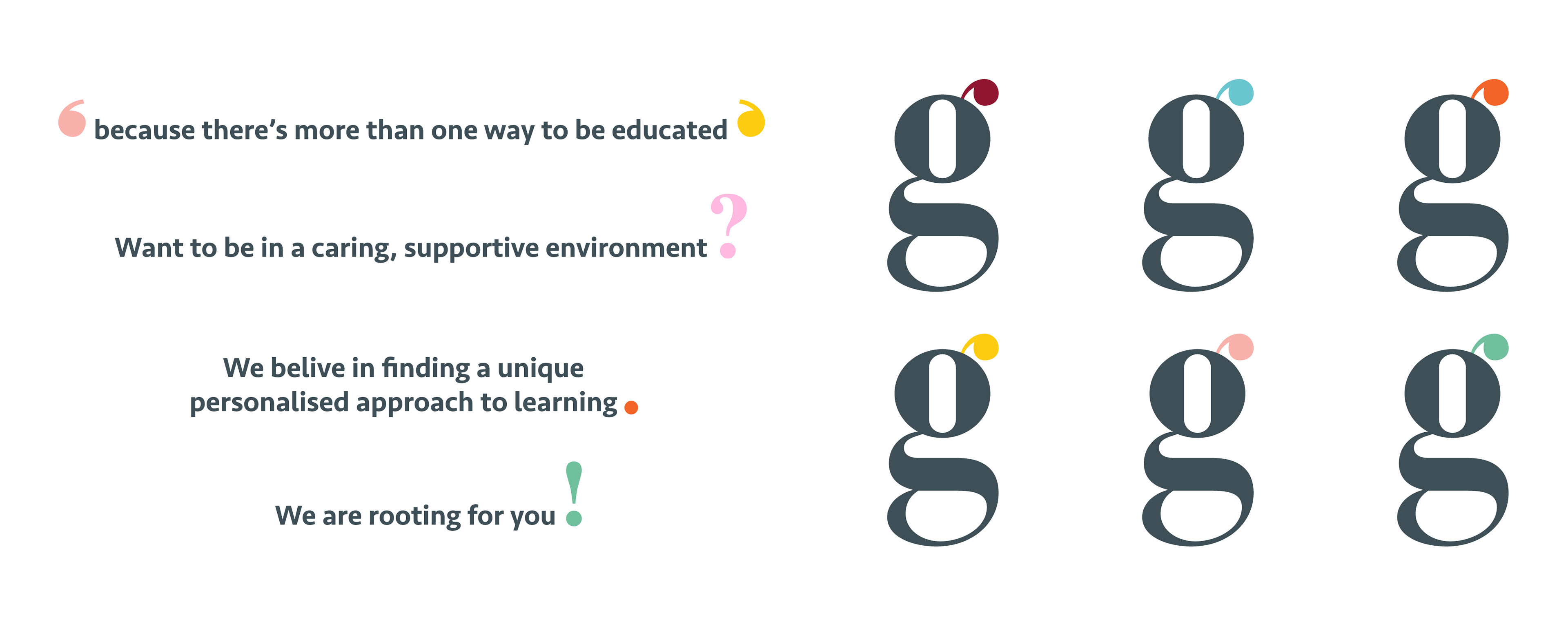
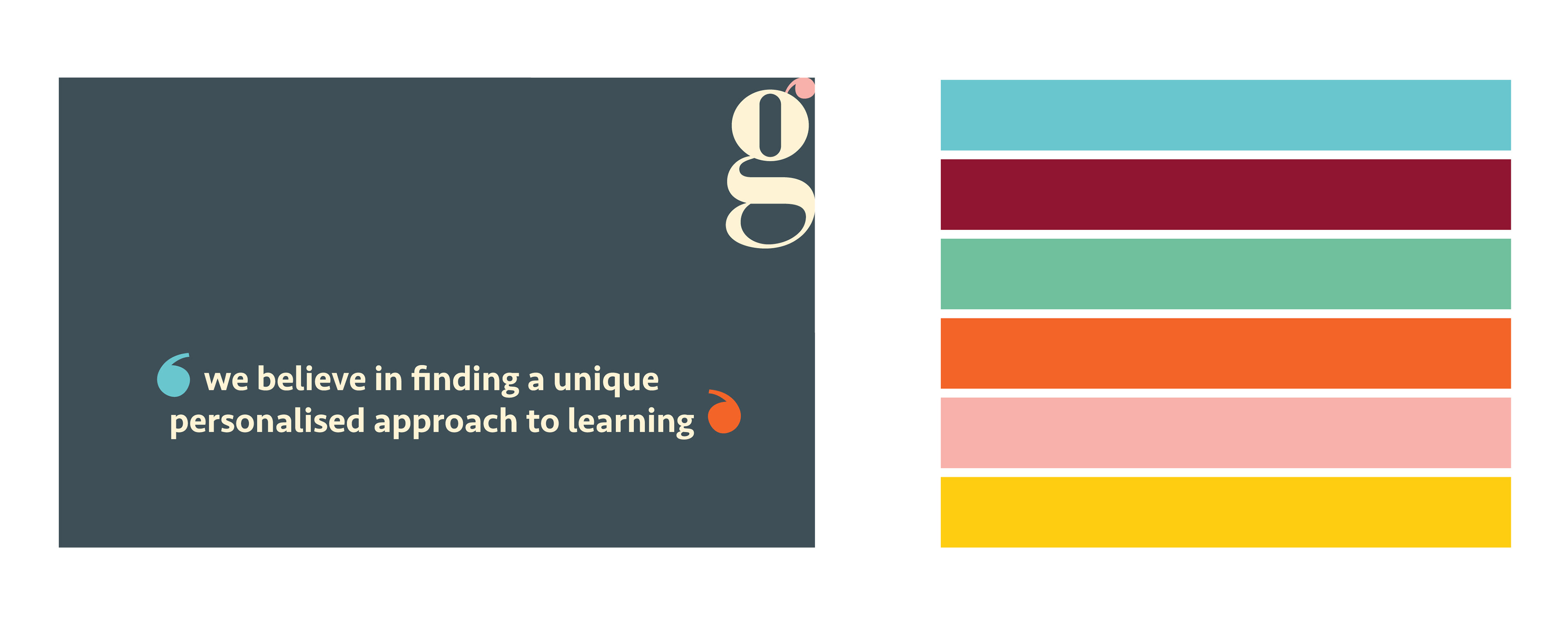
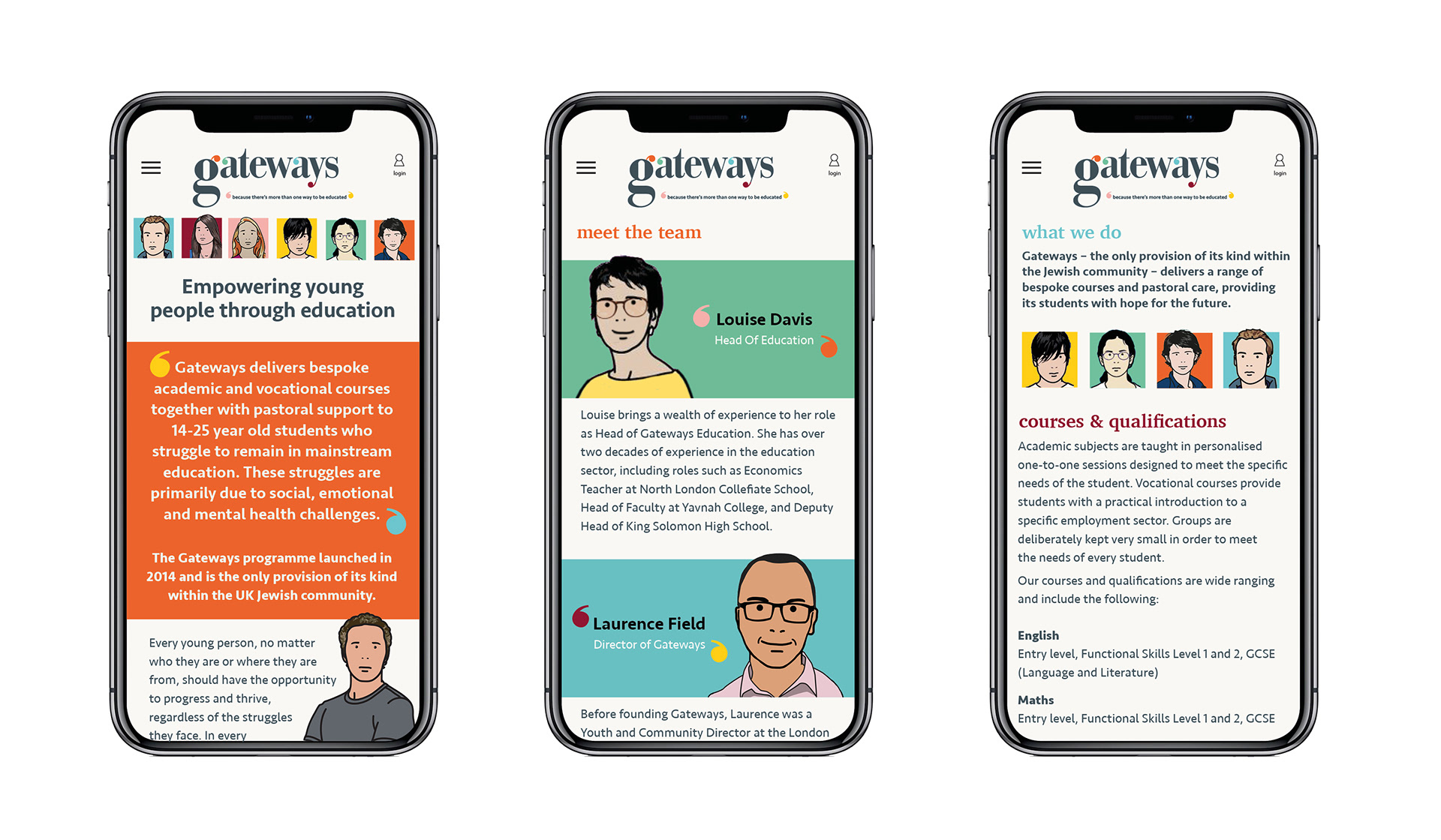
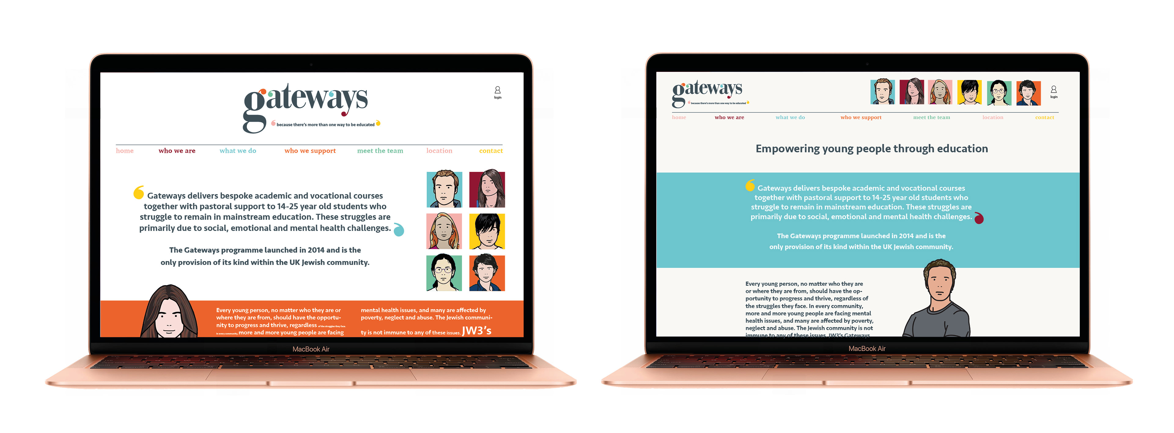

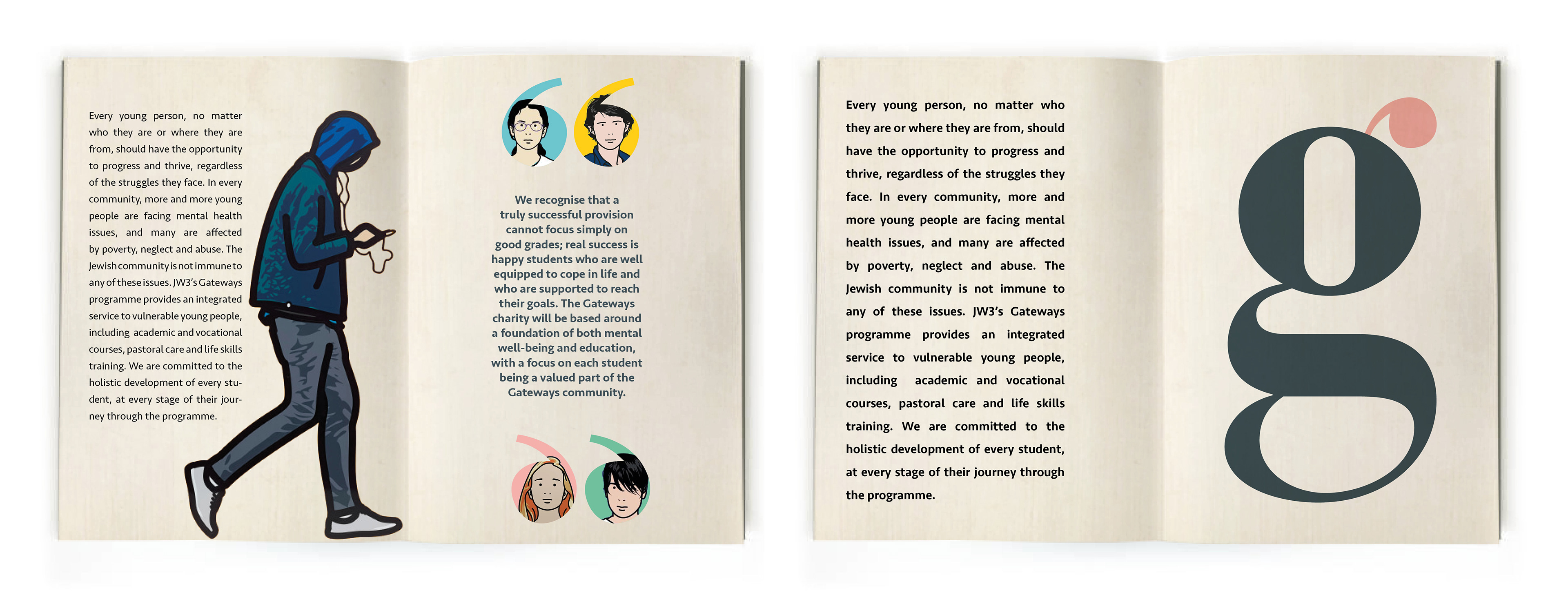
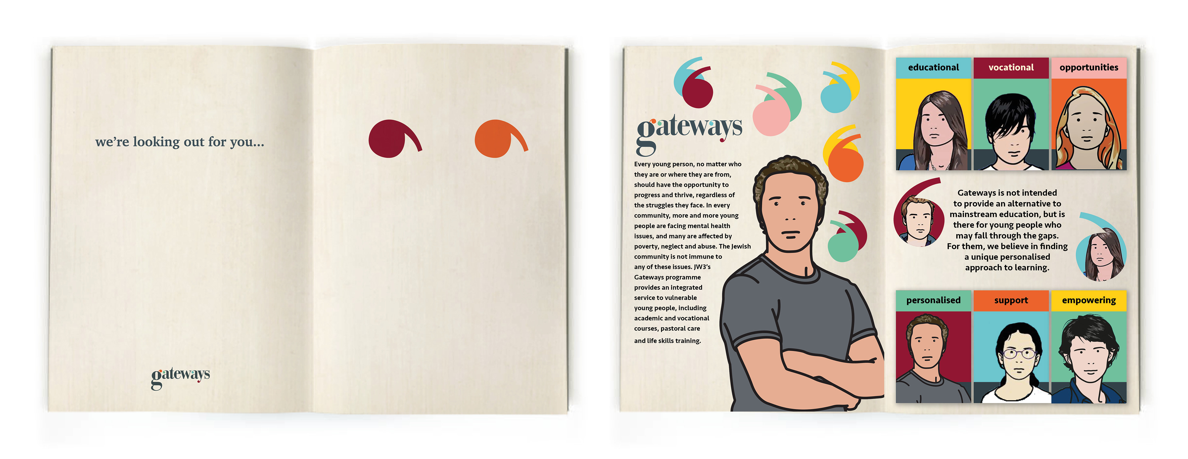
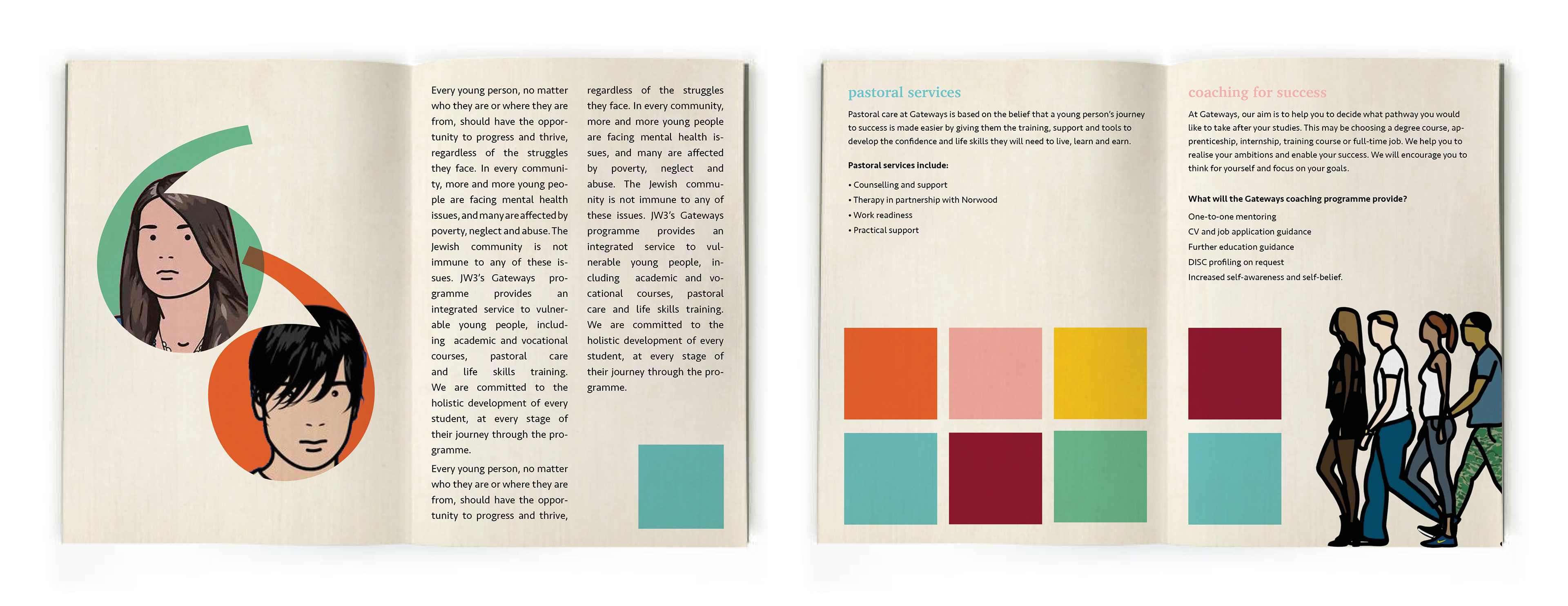
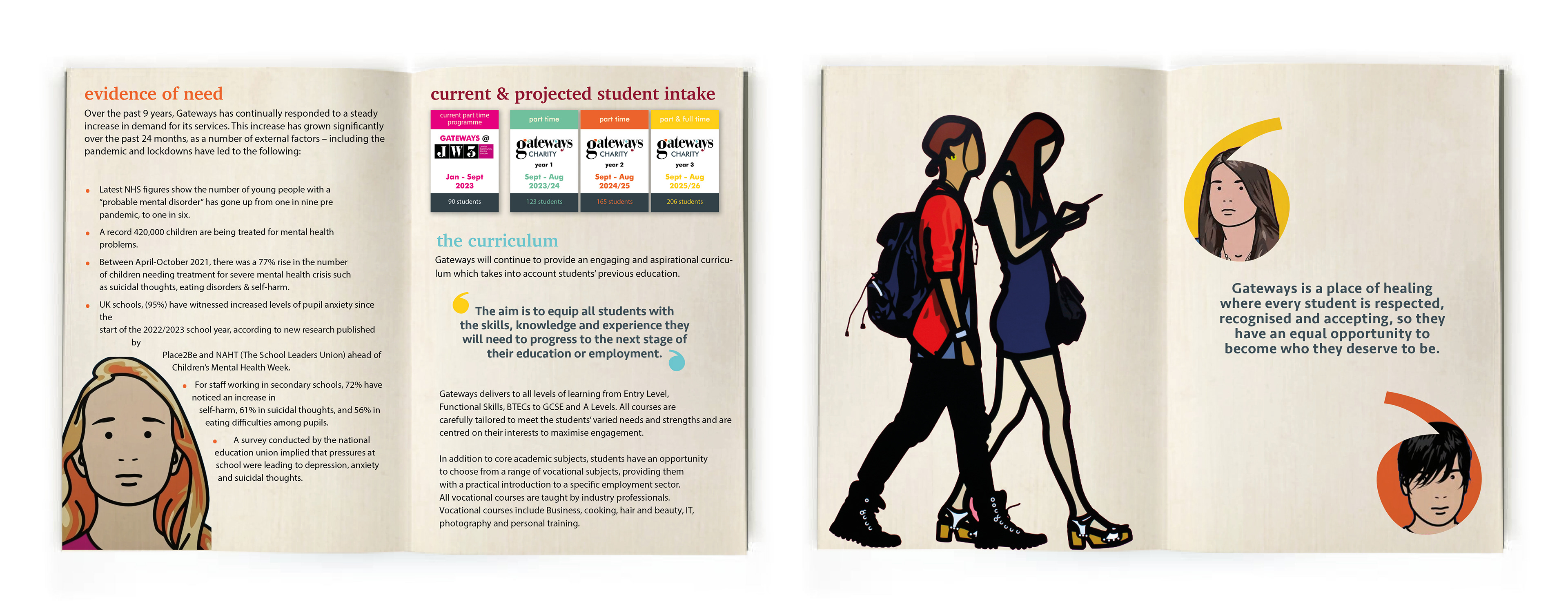
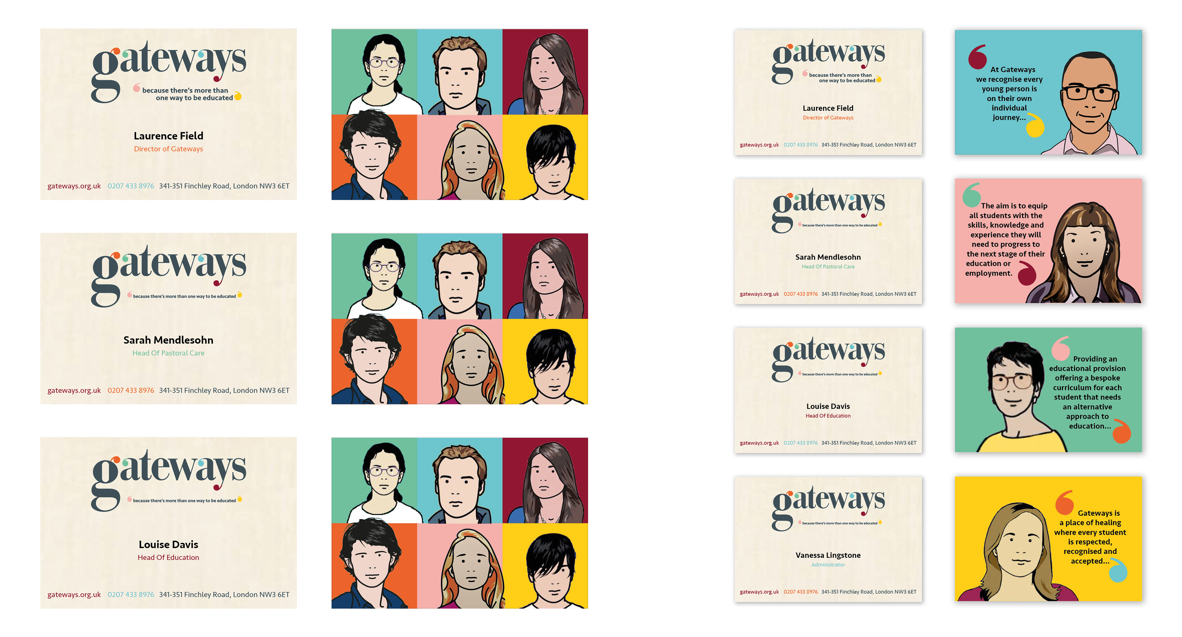
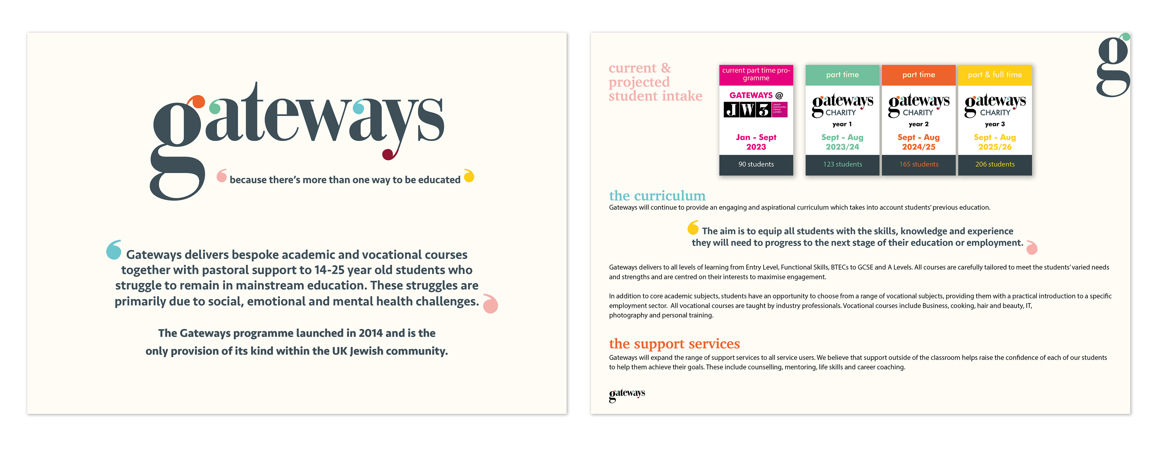
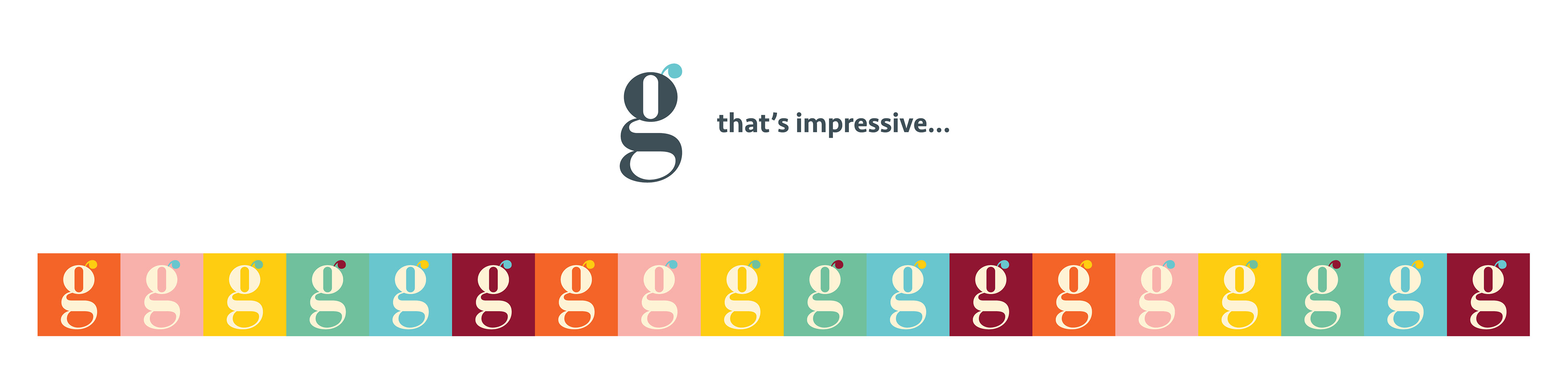
The rebrand for Gateways was developed to support the organisation’s expansion into a new purpose-built facility and reflect its mission of supporting young people unable to attend mainstream education. The project focused on creating an inclusive, engaging and accessible identity that could translate effectively across both digital and print communications. The refreshed visual language introduced a new colour palette and typographic system, using forms derived from the lowercase “g” to create distinctive brand cues and a contemporary identity. The result was a modern and approachable brand system designed to improve recognition, accessibility and consistency across all touchpoints.